We tortured the Qullamaggie strategy. Where does its edge actually come from?
In part 1 the raw systematic version barely made money — the right shape, but a regime roller-coaster. So we put it on the rack: four stress tests that locate the edge, the fragility, and the exact reasons it isn't tradeable as written.
Recap. Part 1 rebuilt Kristjan Kullamägi's published momentum rules mechanically on 1,500 US stocks. The result reproduced his trade signature — small losses, rare huge winners — but as a portfolio it was a coin flip with a −48% drawdown: CAGR 1.7%, Sharpe 0.19. This part asks why, and what would have to change.
Test 1 / The drawdown is a regime story
Split every day by a simple market filter — is the S&P 500 above or below its own 200-day moving average? The strategy spends 81% of its life in the "above" (healthy) regime and the rest in the "below" (unhealthy) one. Here is where the money is made and lost:
| Market regime | Share of days | Cumulative strategy return |
|---|---|---|
| Above 200-day MA (healthy) | 81% | +30% |
| Below 200-day MA (unhealthy) | 19% | −7% |
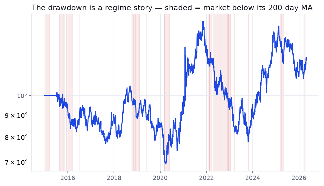
Nearly all the profit is earned in the healthy regime; the unhealthy 19% of days does little but manufacture the drawdown. The strategy buys breakouts indiscriminately, including into the teeth of a falling market. A market filter is the single biggest lever available — and it's exactly the discretionary "is this a market to be aggressive in?" judgement the original trader applies by hand. We'll add it mechanically in part 3.
Test 2 / The entire edge lives in about ten trades
Momentum is supposed to pay through a thin tail of enormous winners. It does — to a fault. Across 2,288 trades, the single best 22 (the top 1%) account for 18% of all gross profit. Pull out just the ten largest winners and the eleven-year result flips from a profit to a loss:
| Scenario | Net P&L (11 years, $100k start) |
|---|---|
| All 2,288 trades | +$20,933 |
| Minus the 10 best trades | −$49,200 |
| Minus the 20 best trades | −$88,982 |
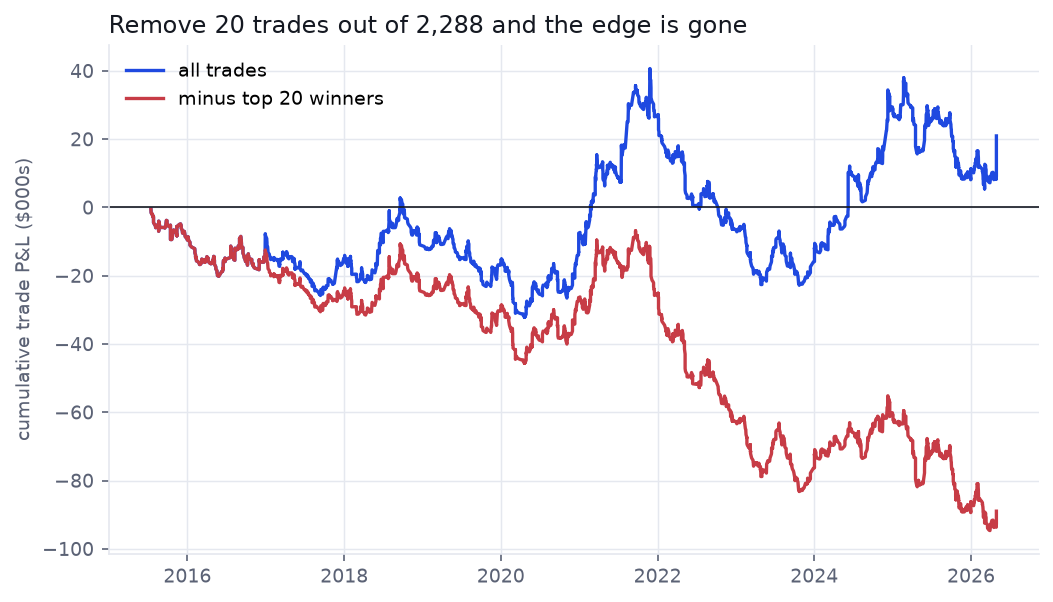
This is the real edge and the real danger in one chart. The fat tail is genuine, but the system is hostage to it: miss a handful of the biggest moves — through hesitation, a tight stop, or taking profits too early — and you are underwater for a decade. This is precisely where a discretionary master and a naïve system diverge, and why "just trail the winners" is far harder to live than to backtest.
Test 3 / The edge is thinner than the spread
Our base case already charges 5 basis points per side in fees and slippage. Watch what a little more does:
| Cost per side (bps) | CAGR | Sharpe |
|---|---|---|
| 0 (frictionless) | 6.1% | 0.38 |
| 5 (base case) | 1.7% | 0.19 |
| 10 | −2.4% | −0.00 |
| 20 | −10.3% | −0.38 |
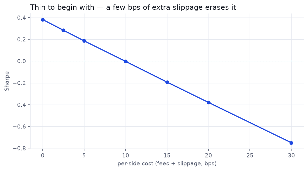
Break-even sits near 10 bps per side. That is a generous budget for blue-chips and a fantasy for the low-float, high-ADR names this strategy is built to chase — the ones that gap on the open and run. The frictionless 0.38 Sharpe is the number a careless backtest reports; the tradeable number is lower still.
Test 4 / Optimizing it doesn't save it
Maybe the defaults are just unlucky. We handed six parameters to Optuna and let it search 80 configurations to maximize the in-sample (2015–2020) Sharpe, then asked two honesty questions of the winner. The first: the Deflated Sharpe Ratio, which discounts a result for how many configurations you tried. The second: does the in-sample champion survive on unseen 2021–2026 data?
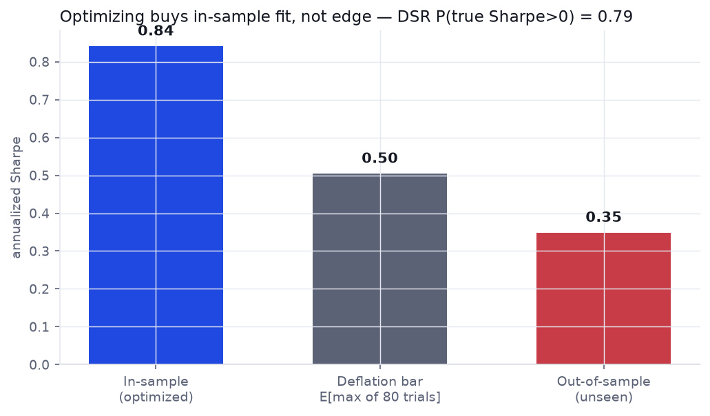
Optimization more than quadrupled the in-sample Sharpe, from 0.19 to 0.84. But after searching 80 configurations, you would expect a best-of-batch Sharpe of 0.50 from luck alone — so the Deflated Sharpe Ratio leaves only a 0.79 probability that the edge clears that selection bar, short of the ~0.95 you'd want before believing it. And out-of-sample the tuned Sharpe collapses to 0.35, still attached to a −40% drawdown. The optimizer bought in-sample fit, not a tradeable edge — the exact trap our overfitting guide is about.
And we are still flattering it
Every number above is an optimistic upper bound, because the universe is the current S&P 1500 — the survivors. Split it by liquidity and the strategy's return leans on the smaller, more delisting-prone names:
| Sub-universe | CAGR | Sharpe | Max drawdown |
|---|---|---|---|
| Large-cap (top 500 by volume) | 5.4% | 0.38 | −35% |
| Small / mid-cap (the rest) | 7.5% | 0.44 | −49% |
The smaller names carry more of the return — and they are exactly the population where survivorship bias bites hardest, since the small caps that went to zero after a failed breakout are simply absent from a current-constituents list. We can't measure the inflation precisely without a point-in-time, delisting-inclusive universe (a structural limit we flag rather than paper over); the academic range for momentum is roughly one to a few points of CAGR. Whatever the exact figure, it cuts the wrong way.
A faint, real momentum edge — wrapped in three problems.
The signal isn't noise: there is a genuine tail and a weakly positive deflated result. But raw, it is regime-blind, hostage to a dozen trades, priced for costs it won't get, and flattered by survivorship. None of those are the signal's fault — they're the absence of the discipline the original trader supplies by hand. That's a testable hypothesis: add the discipline, and see if a faint edge becomes a real one.
Can the discipline be systematized?
We rebuild it with the three missing pieces — a regime filter so it sits out bad markets, volatility-scaled sizing, and rule-based profit-taking — re-optimize honestly, and judge the improved version against a real Go/No-Go bar. Either honest validation turns a faint edge into a tradeable one, or it tells us to leave it on the shelf.
Run the same checks on your own backtest
ToolDeflated Sharpe Ratio — feed it your trial count and watch the headline Sharpe deflate Tool
Backtest Costs — turn a gross curve into a net one and find your break-even bps Tool
Position Size & Risk of Ruin — size a fat-tailed, low-win-rate system to survive